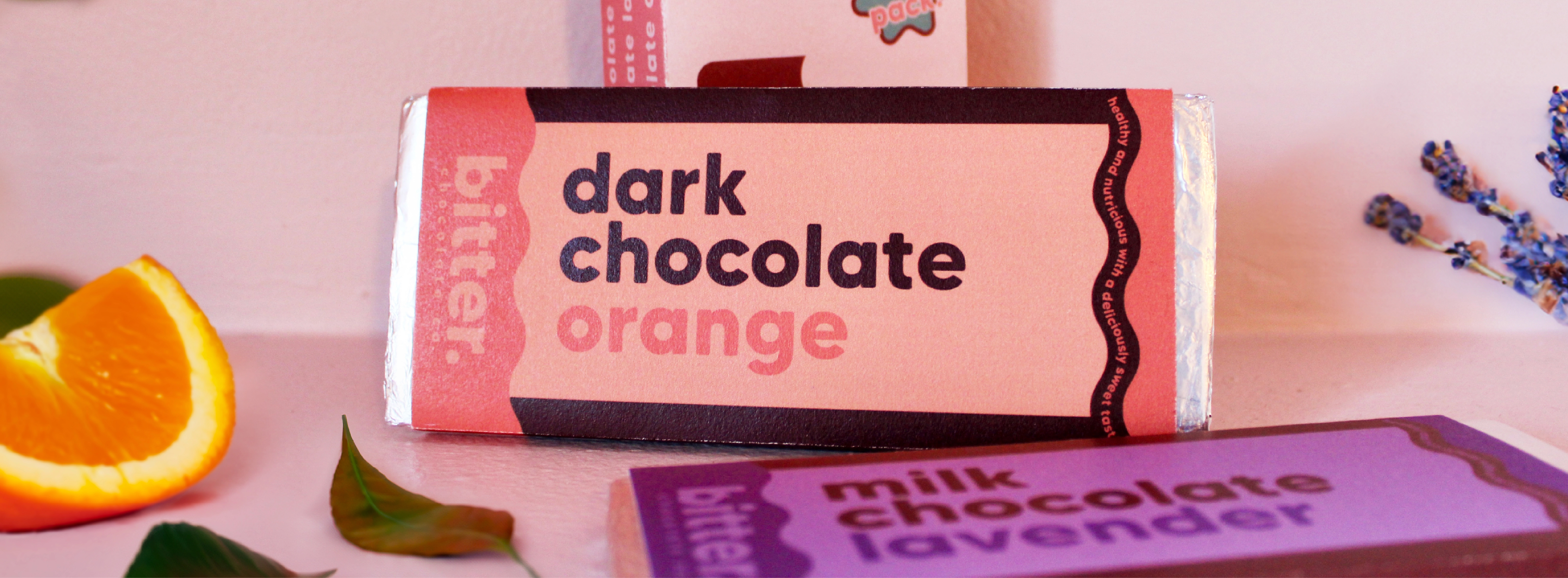
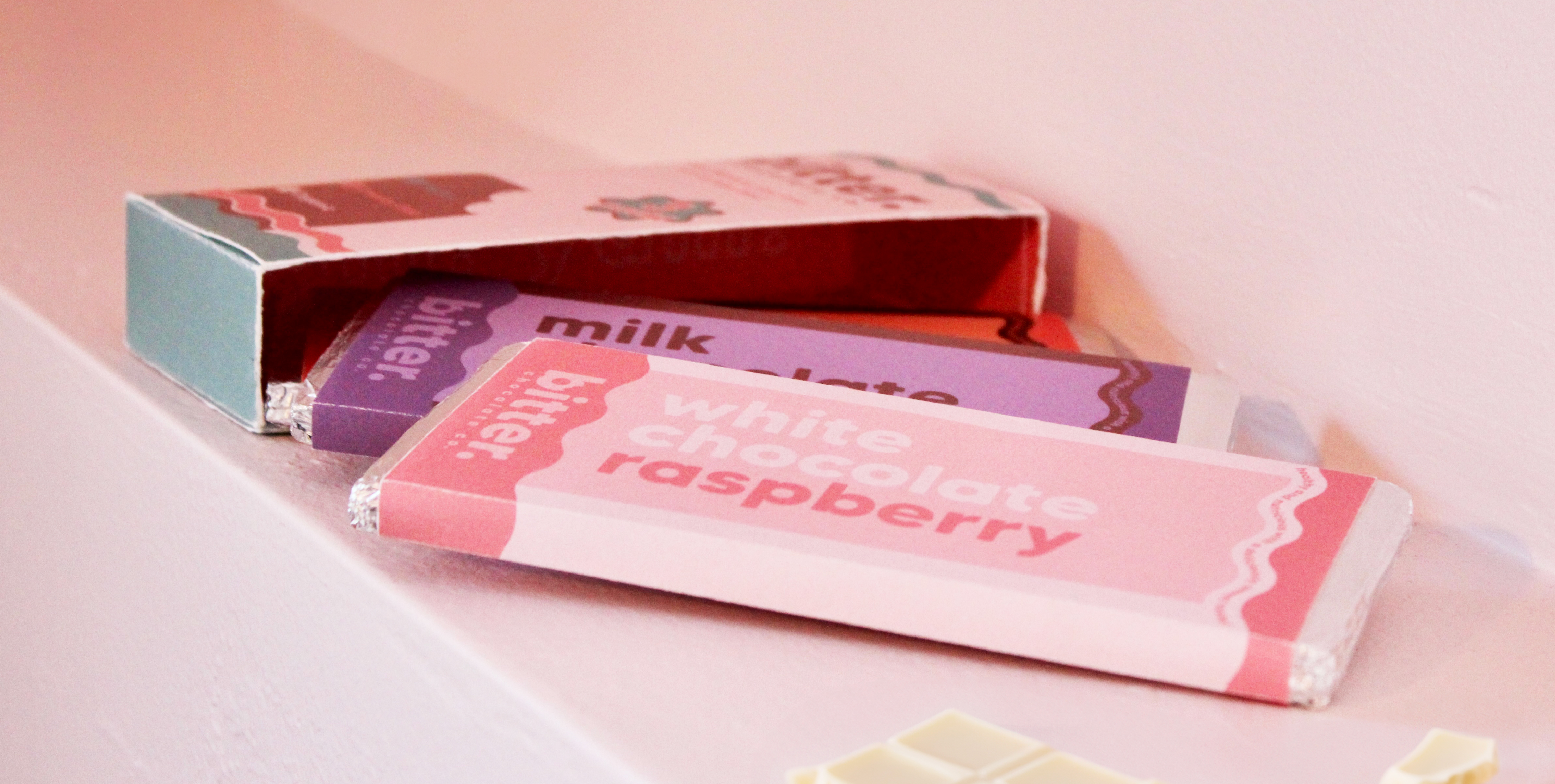
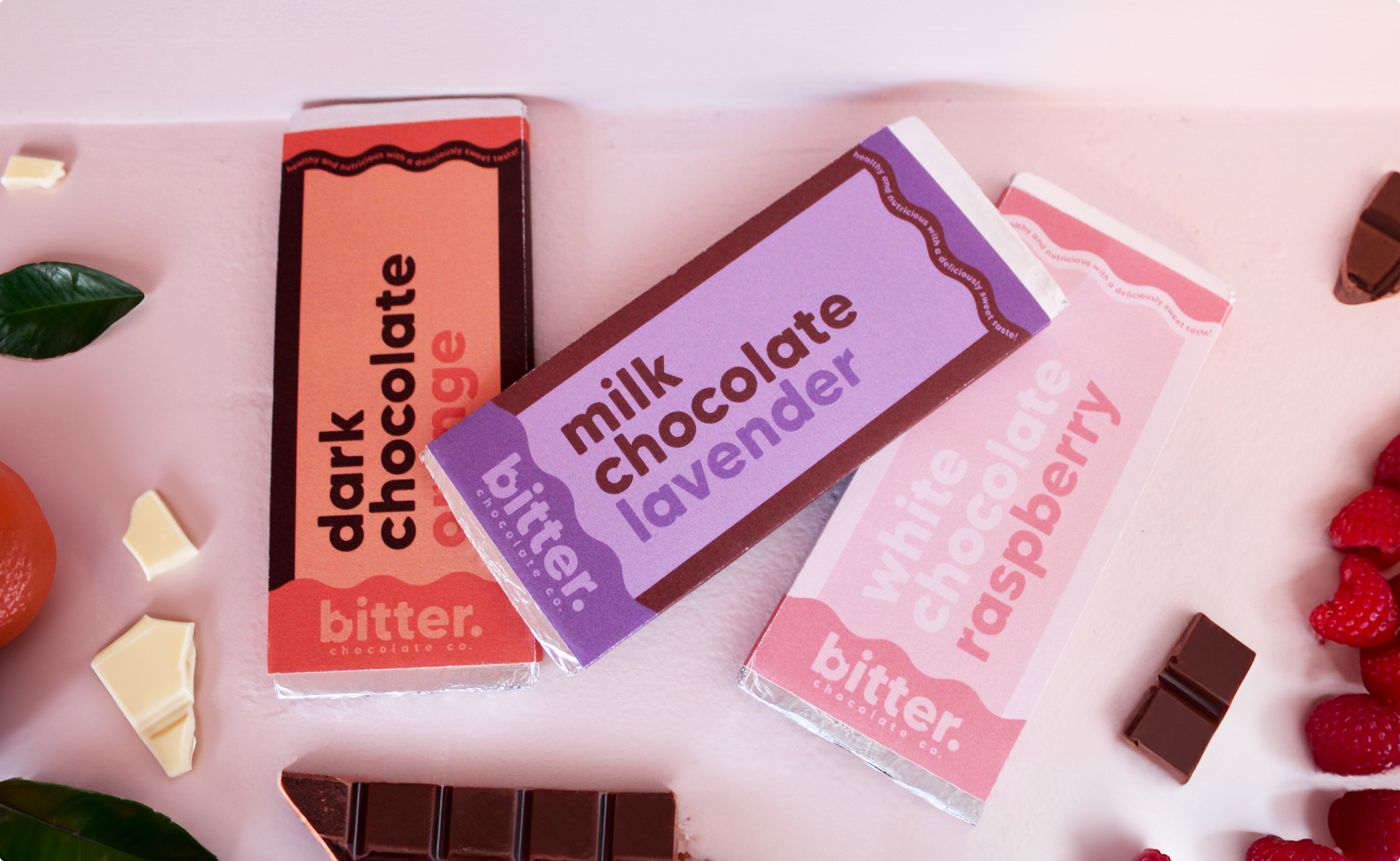
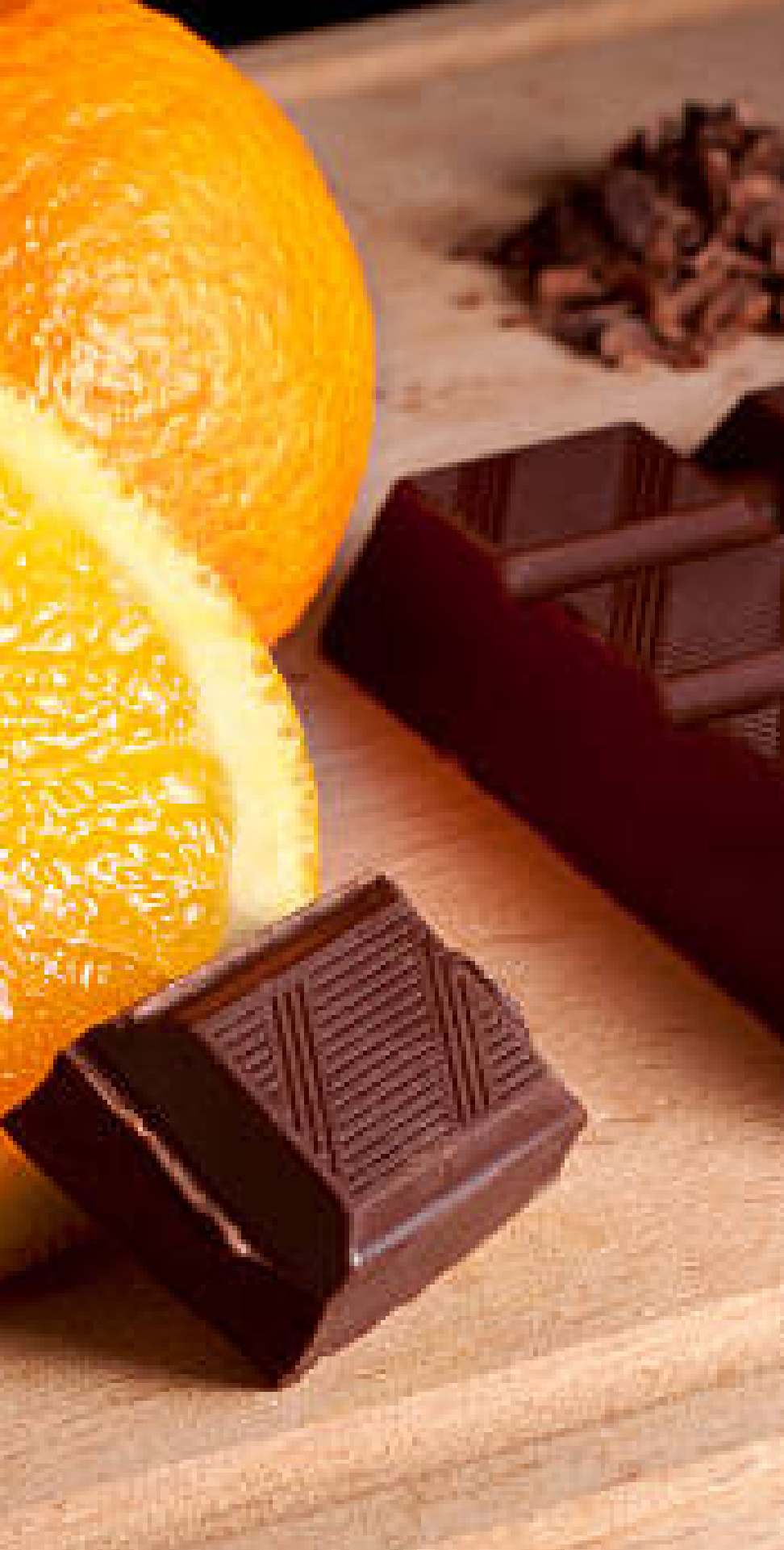
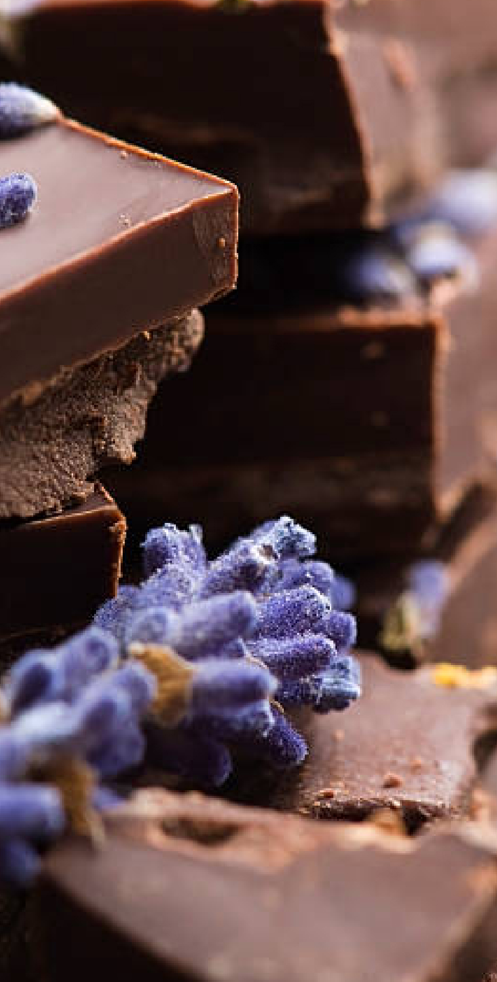
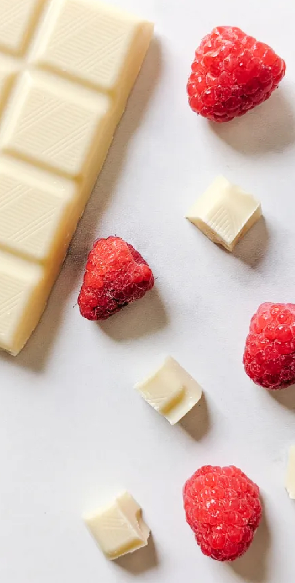
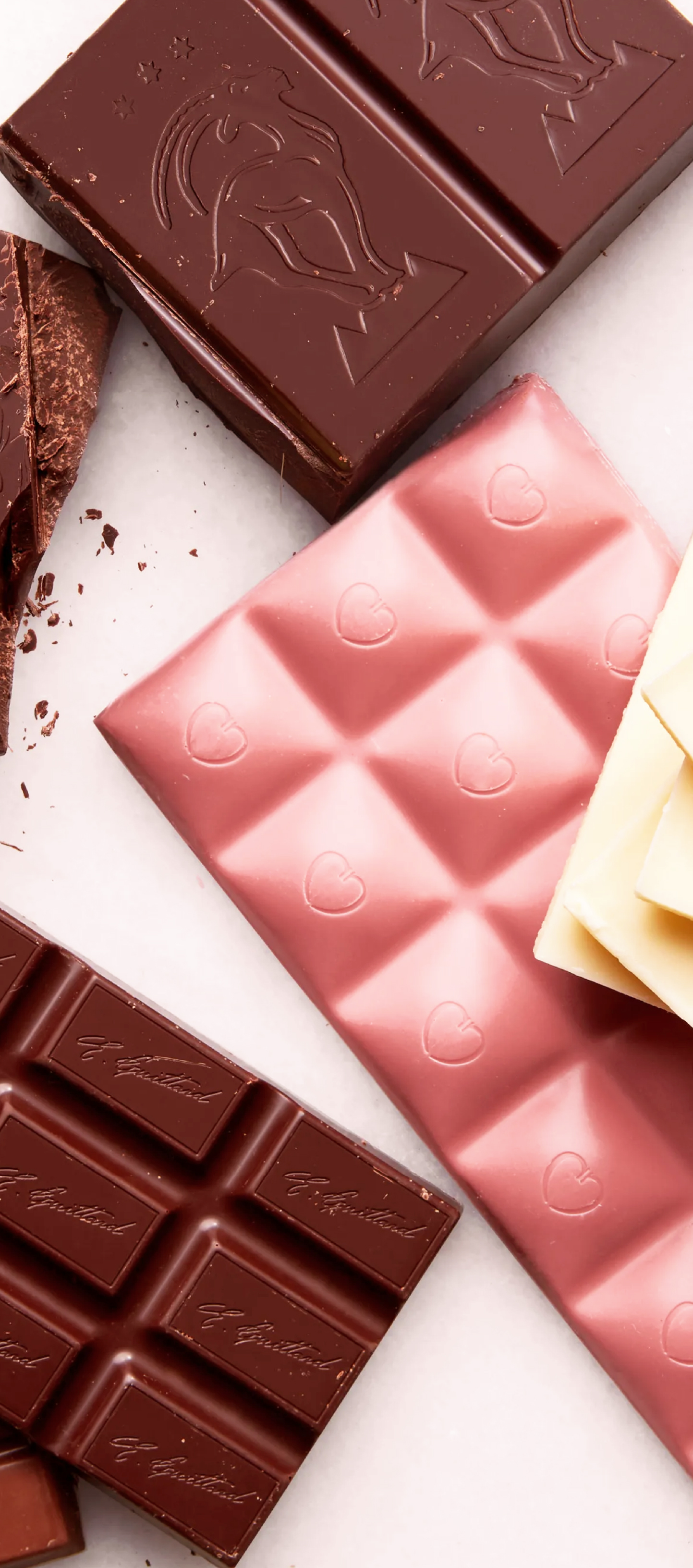
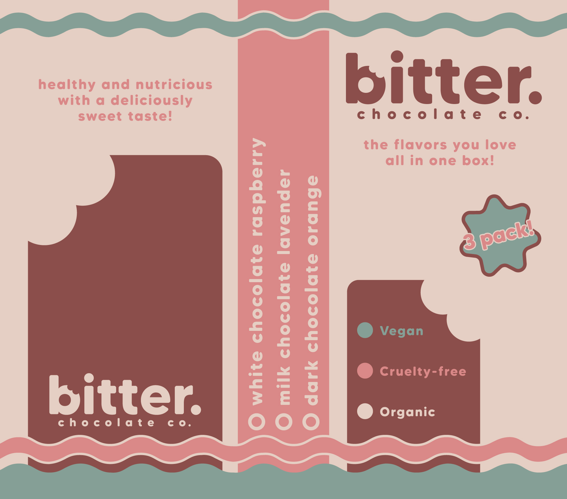
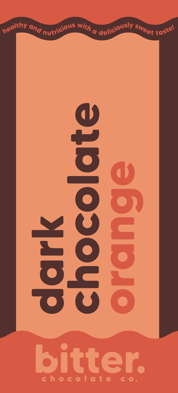
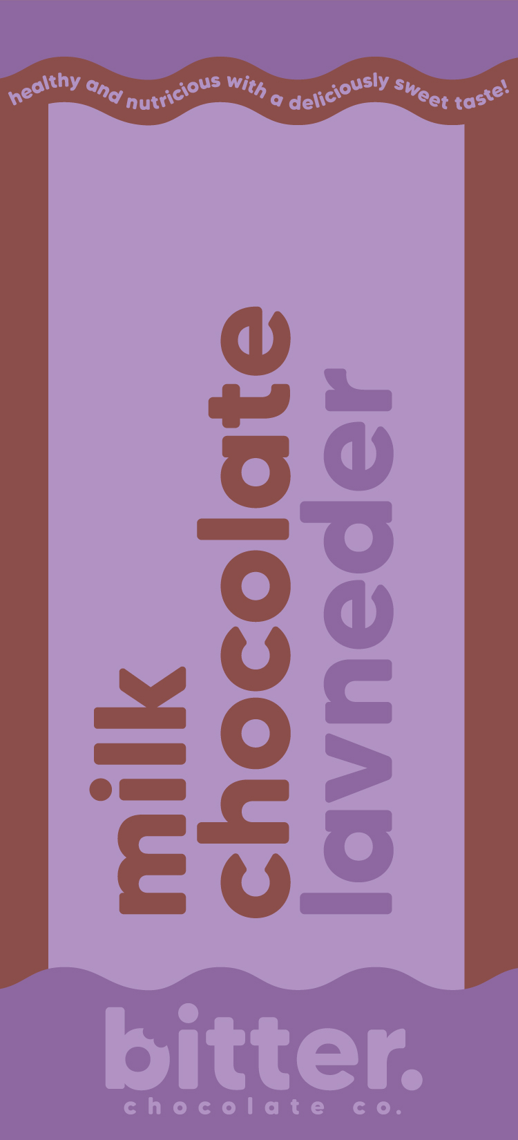
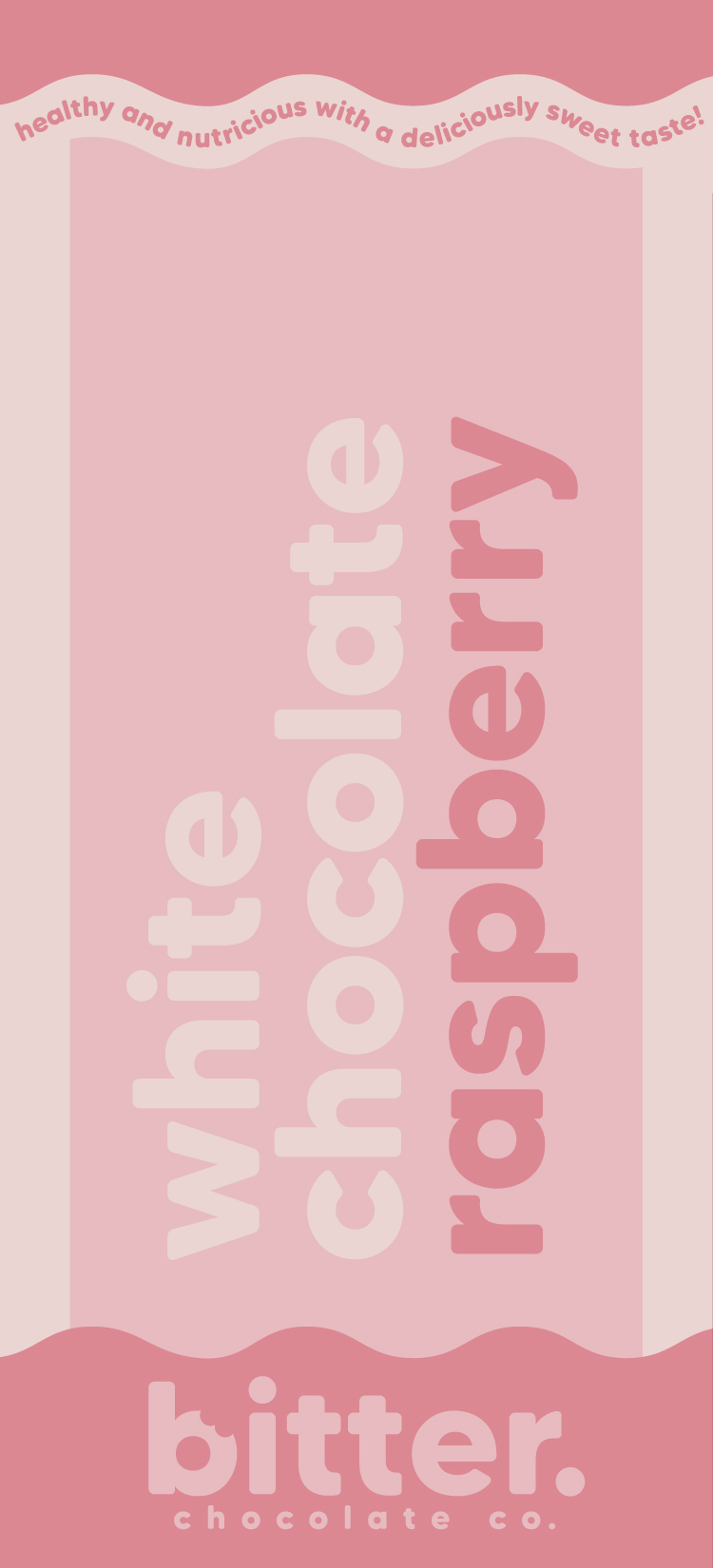
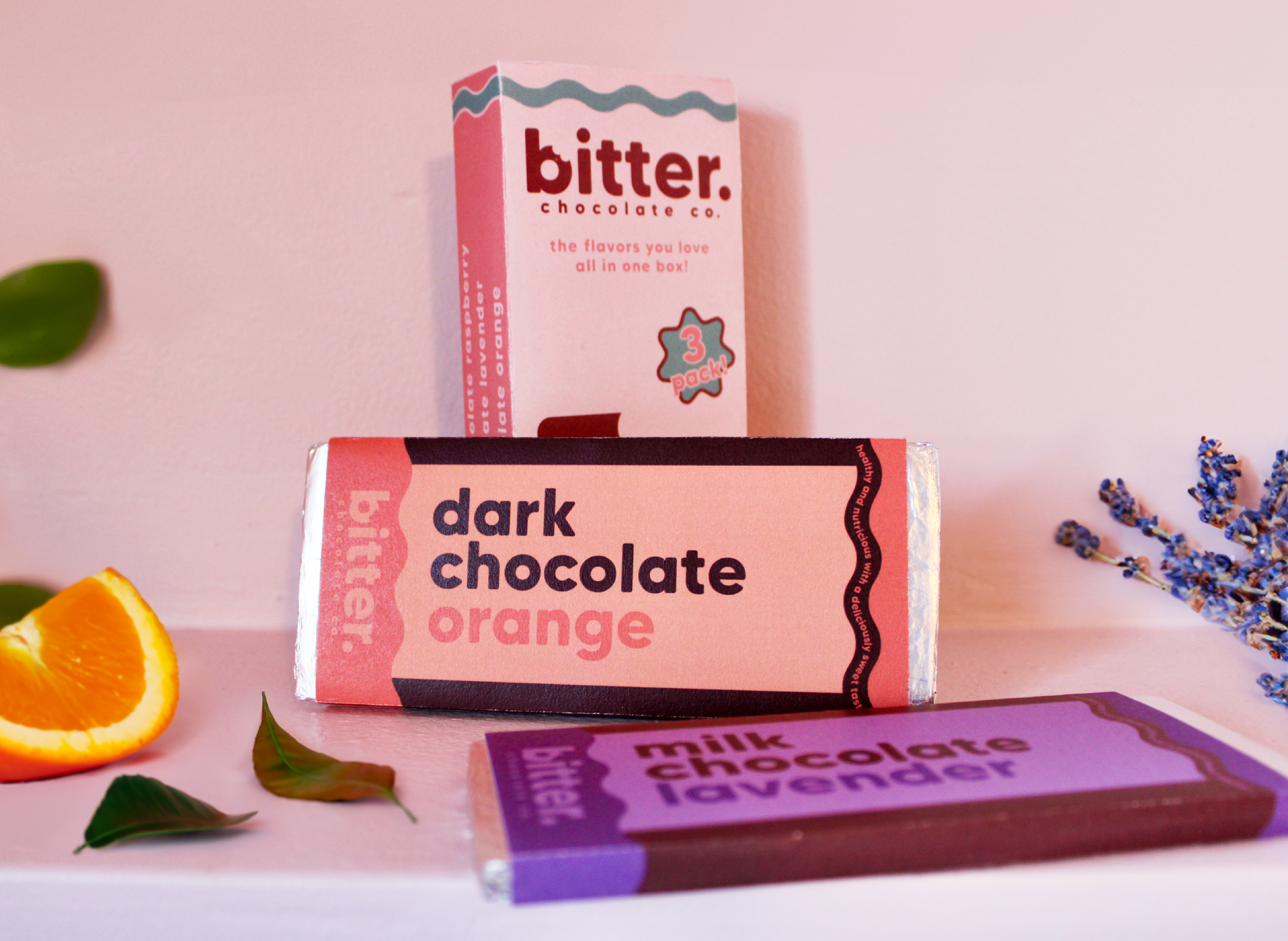
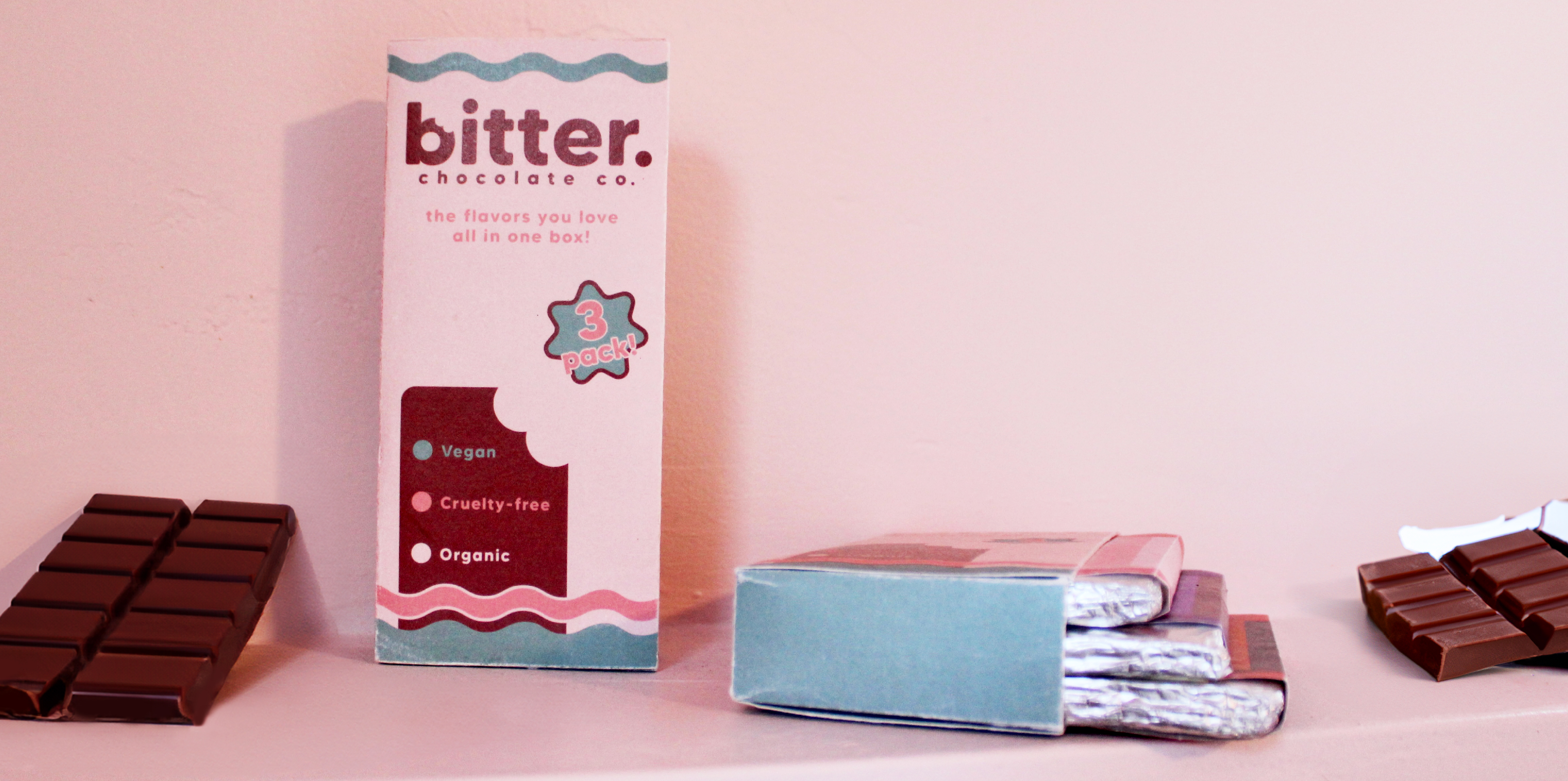
A packaging concept for a 3-pack of chocolate bars.
Identity Design, Package Design
These designs for a 3-pack of uniquely flavored chocolate bars take inspiration from current trends of organic and eco-friendly food companies. The name Bitter provides an ironic sense of humor while the organic shapes and pastel color palette aim to create an appetizing and welcoming aesthetic.